Case study · Branding & Web UI · 0→1
Wuchh: helping travellers see Kashmir through the eyes of a local.
A two day 0→1 design sprint: building a lifestyle travel brand from name, to visual identity, to a full website UI. The whole idea lives in one Kashmiri word: Wuchh, meaning "to see."
Role
Brand, UX & UI Designer (solo)
Context
Freelance brief · performance marketing agency
Timeline
2 days
Platform
Desktop web · Figma
Overview
About Wuchh
The brief was completely open ended: I could build a brand in any category I liked, whether ecommerce, home services, travel, or something entirely my own. Travel caught my eye immediately. I belong to Kashmir, and I grew up watching tourists come and go. One question always stayed with me: what if tourists could travel like a local? That question became the foundation of the brand.
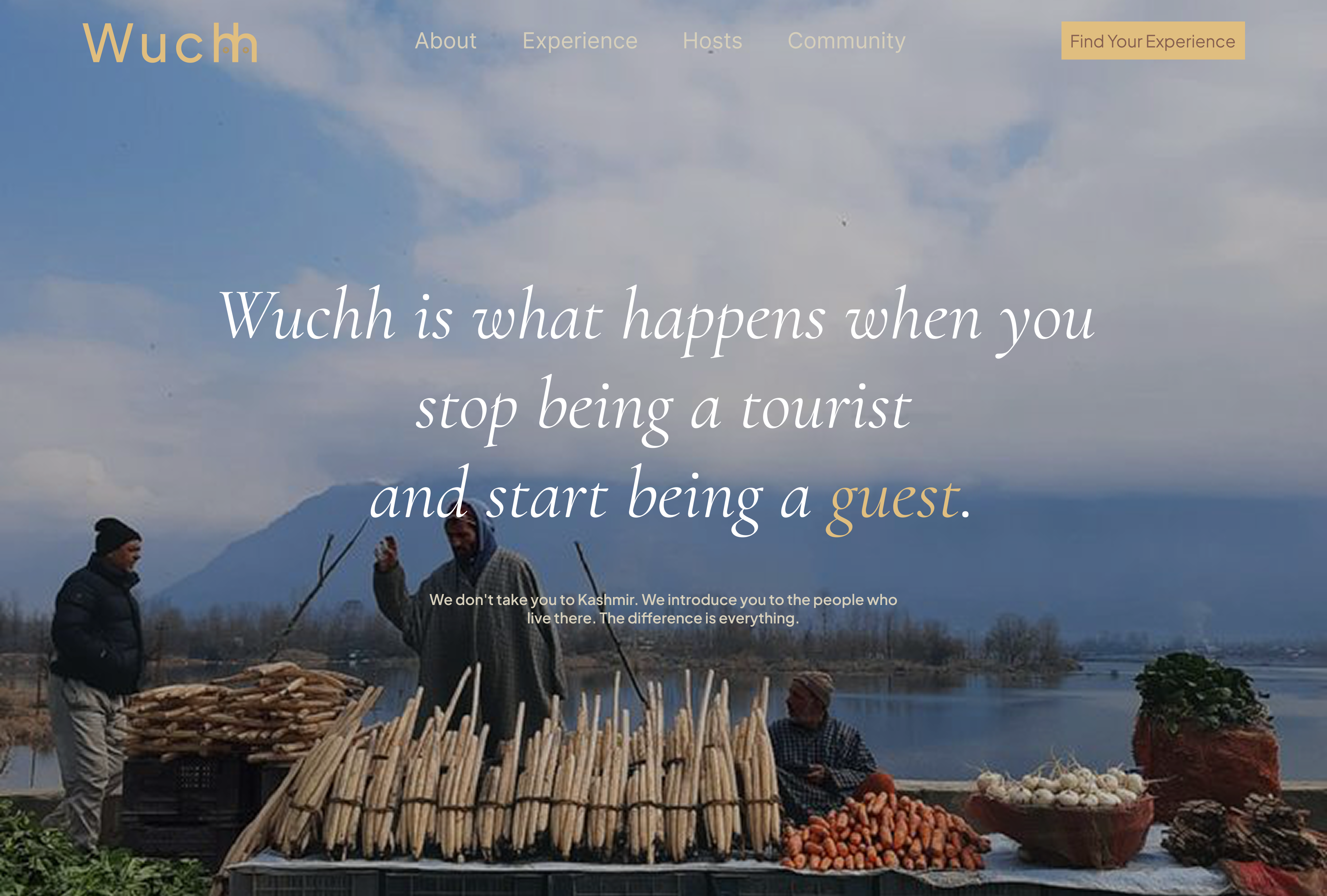
Wuchh is a lifestyle travel brand built around one idea: helping travellers experience Kashmir the way locals live it, not the postcard version. Not a website. A journey from stranger to guest.
The brief
A freelance design task from a performance marketing agency, with a 48 hour deadline. It was deliberately open ended: choose any category, whether ecommerce, home services, travel, or my own, and take it all the way through. I chose travel, for the reasons above. The deliverables spanned the full 0→1: a brand foundation (name, positioning, and core personality), a visual identity (colour, typography, logo), competitive analysis, and a complete website UI.
Outcomes
Delivered end to end in two days, so the impact here is about depth of thinking, not live metrics:
I later turned the design into a live, working prototype built with Claude Design and deployed on Vercel, so the concept could be experienced, not just viewed. The full UI lives on the Figma file →
My role
Sole designer. I owned naming and positioning, the colour and type system, the logo, competitive research, wireframes, and the full high fidelity website UI.
Constraint
Two days, solo, from nothing. The timeline forced sharp decisions; every choice had to earn its place fast.
The brand & who it's for
To find the right name, I first defined what the brand should stand for. The words that kept surfacing were travel, youth, and a deep connection to Kashmir.
Who it's for
The audience shaped itself around three groups:
- 25 to 30: just out of structured student life, discovering their own world, hungry to explore.
- 30 to 35: balancing work with growing responsibilities, looking for breathing room and genuine experiences.
- 35 to 40: found their footing, know what they want, seeking real connection with people and nature.
Finding the name
I started with keywords like Ghoomna, Mazay, local touch, youth, Kashmiriyat, and journey. A few names emerged:
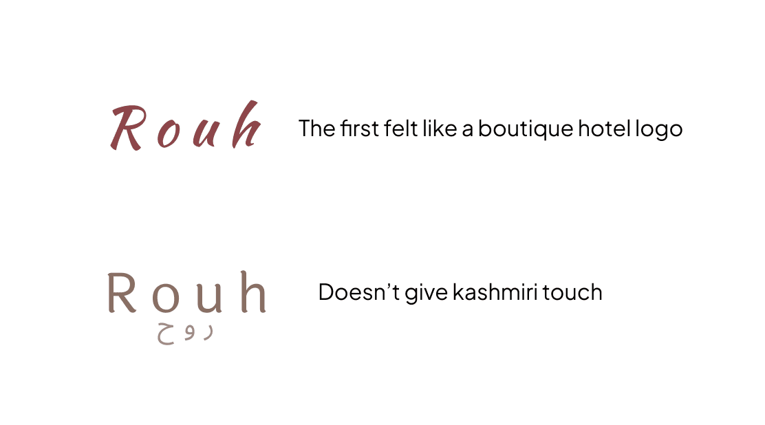
✗ Raah ("journey"). I liked it, but it felt too general. The Kashmiri local touch was missing.
✗ Rouh ("soul"). Poetic, and I'll admit I kept gravitating to names starting with R (mine does too, so maybe I was a little biased). But it still lacked local grounding, and the logo read like a boutique hotel.
Colour & typography
A palette pulled from Kashmiri life
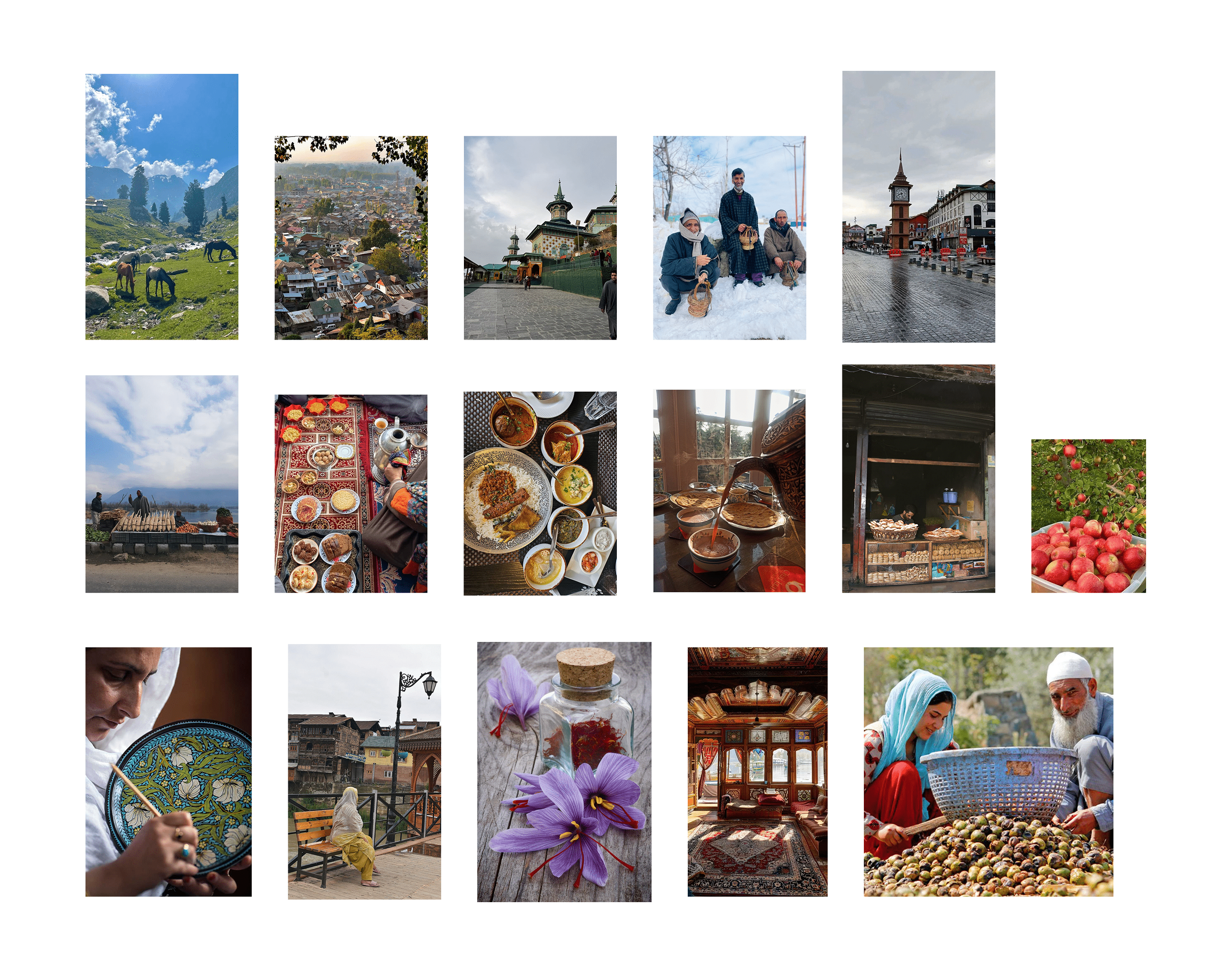
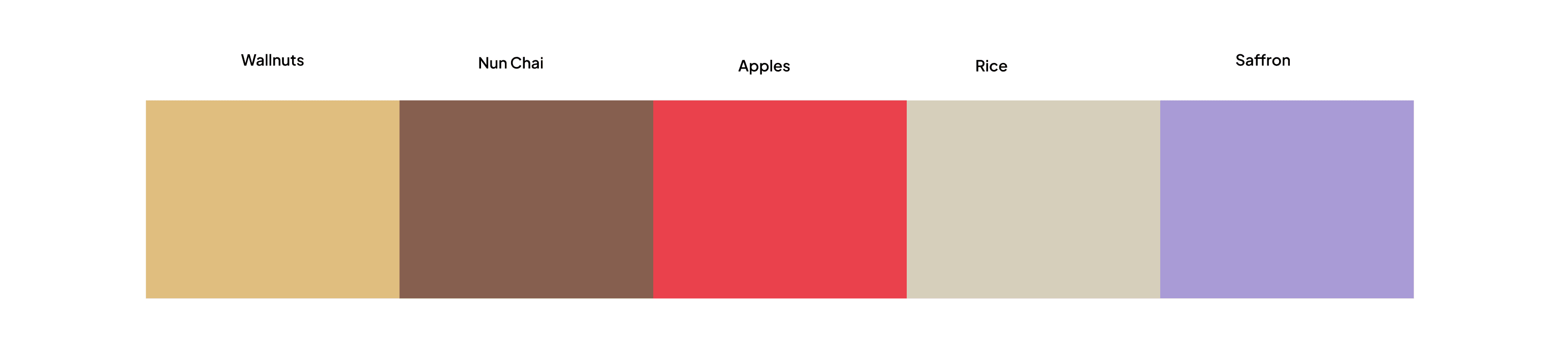
I wanted every colour drawn from real, local life, not generic travel brand aesthetics. I built a Pinterest moodboard around Kashmiri life, locals, food, art, and Kashmiriyat: the everyday version locals live, not the postcard version. Each colour is named after something real:
- Walnut Brown (primary): Kashmiri walnut wood and its craftsmanship. Authenticity, heritage, warmth. The soul of the palette.
- Noon Chai Pink (secondary): traditional Kashmiri salt tea. Hospitality, comfort, community.
- Apple Red (accent): the famous Kashmiri apple. Energy, freshness, the spirit of exploration.
- Rice Beige (neutral): the daily staple. Simplicity, balance, the beauty of ordinary local life.
- Saffron Gold (expressive): Kashmiri saffron. Celebration, premium experiences, and a deliberate touch of coolness in a warm palette.
Typography
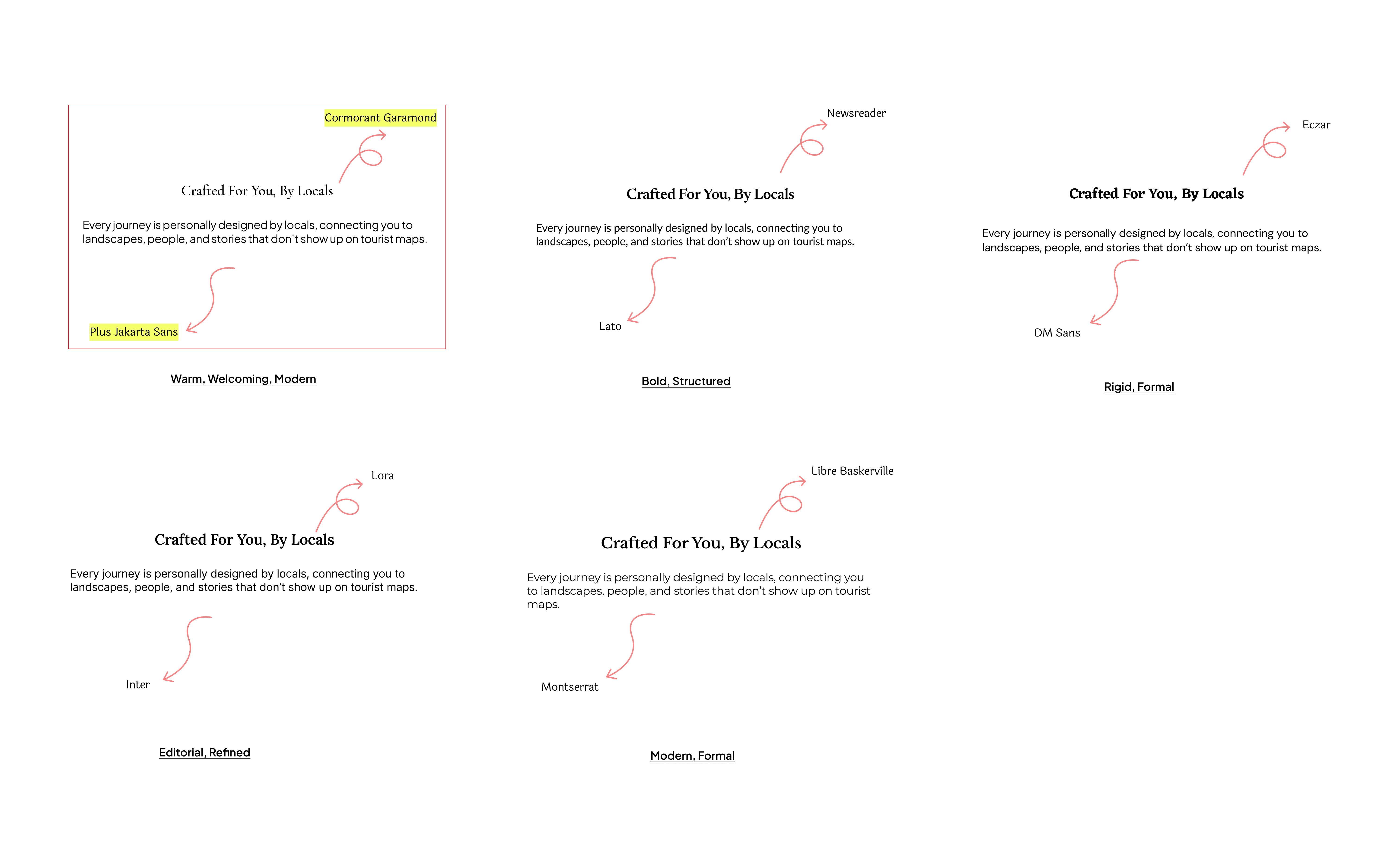
I wanted something sleek, modern, and welcoming: premium but never cold. I defined my requirements, gathered options, and made the final call myself: Cormorant Garamond to attract attention (primary), Plus Jakarta Sans to deliver information (secondary). Together they feel warm, welcoming, and modern. I built the type scale on visual judgment across H1 to H3 and body, for clear hierarchy without feeling mechanical.
The logo
The thinking was simple. Wuchh means to see. Eyes represent observation. Locals see what tourists miss. So the logo builds the eyes right into the name: one word, one idea, one visual.
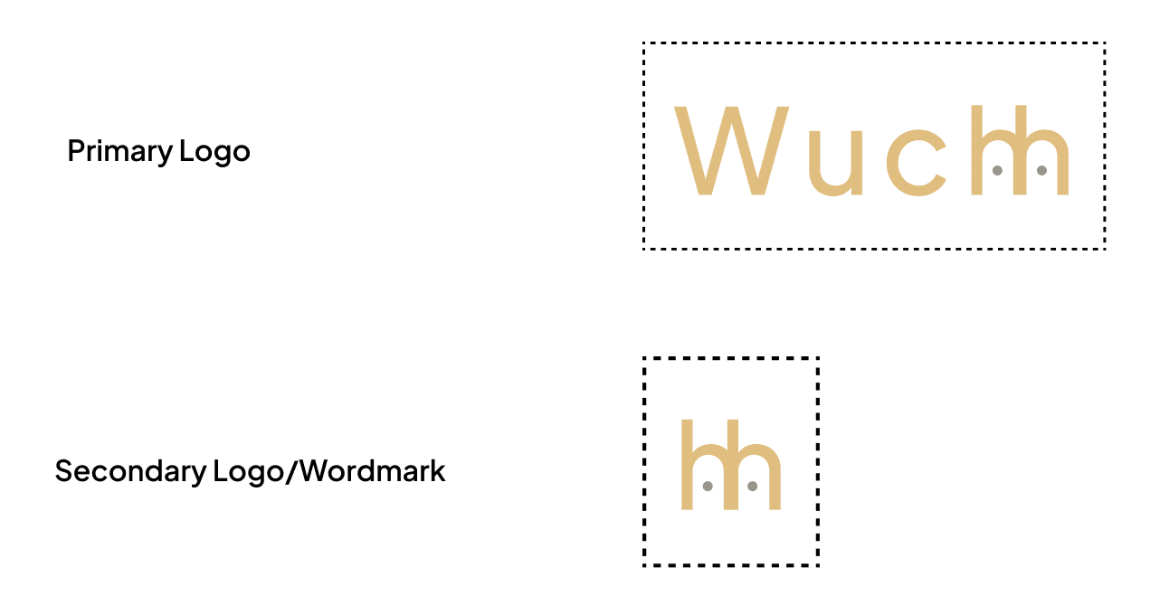
But when I sat with the first version, the eyes felt clever more than rooted. It was wordplay that could belong to any brand about "seeing." It was missing Kashmir.
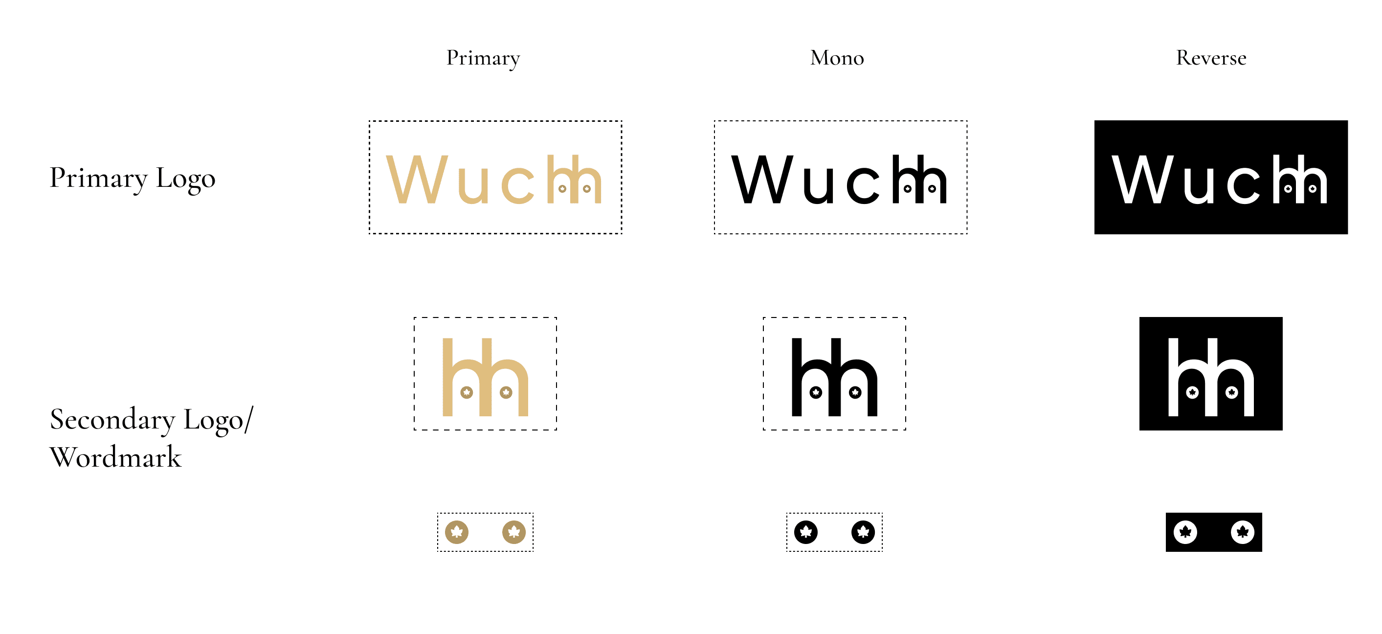
So I looked for the most Kashmiri detail I could hide in plain sight, and landed on the chinar, the tree that lines every old Srinagar street and turns the valley crimson each autumn. I set a tiny chinar leaf as the pupil inside each eye. Now the logo carries both ideas at once: the act of seeing, and the place doing the looking.
The gap & positioning
I ran a competitive analysis of three brands in the same space: NotOnMap, Local Narratives, and Spiti Ecosphere. All three emphasise local community tourism. (Full research →)
Beyond content, competitors put little thought into visual identity. Wuchh answers that directly with a Kashmiri inspired palette and a type system that balances cultural storytelling with modern readability.
Positioning
Wuchh is the only cultural travel brand that treats knowing where you are, why it matters, and who you're staying with as the experience itself, not the backdrop. Where NotOnMap gives access to a rural house, Local Narratives a fellowship, and Spiti Ecosphere a community project, Wuchh makes a guest who earned their place at the table.
Wuchh does not compete on inventory, price, or impact metrics. It competes on depth.
UI design
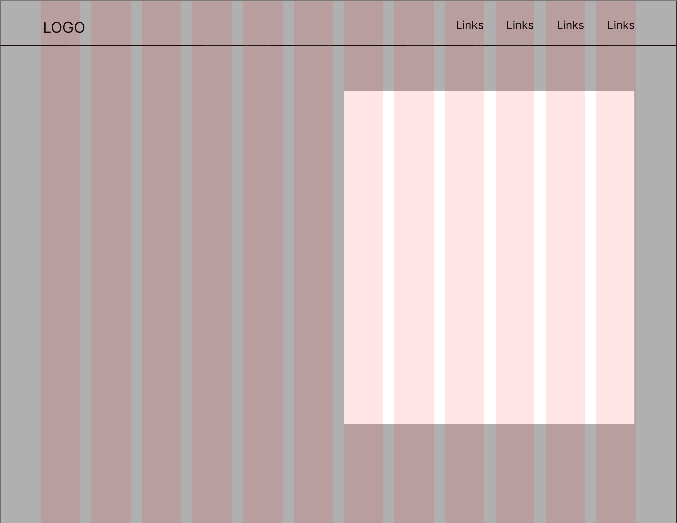
With the brand in place, I moved into UI, starting with wireframes and mapping every section before touching visuals. I followed an 8 point grid throughout (12 columns, 88 margin, 24 gutter) to keep the layout consistent and easy to build on.
Design 1: the site as a story
I wanted the site to reveal itself like a story as you scroll: the hero introduces Wuchh, the second section shows what you'll experience, the third builds trust, the fourth invites you to explore, the fifth sets expectations, the sixth brings in host stories (the human heart), and the seventh closes with reviews.
Navigation bar
Subtle at first, present when needed. Transparent over the hero so the imagery breathes; as you scroll it fills in and the logo shifts to its variation.
Hero
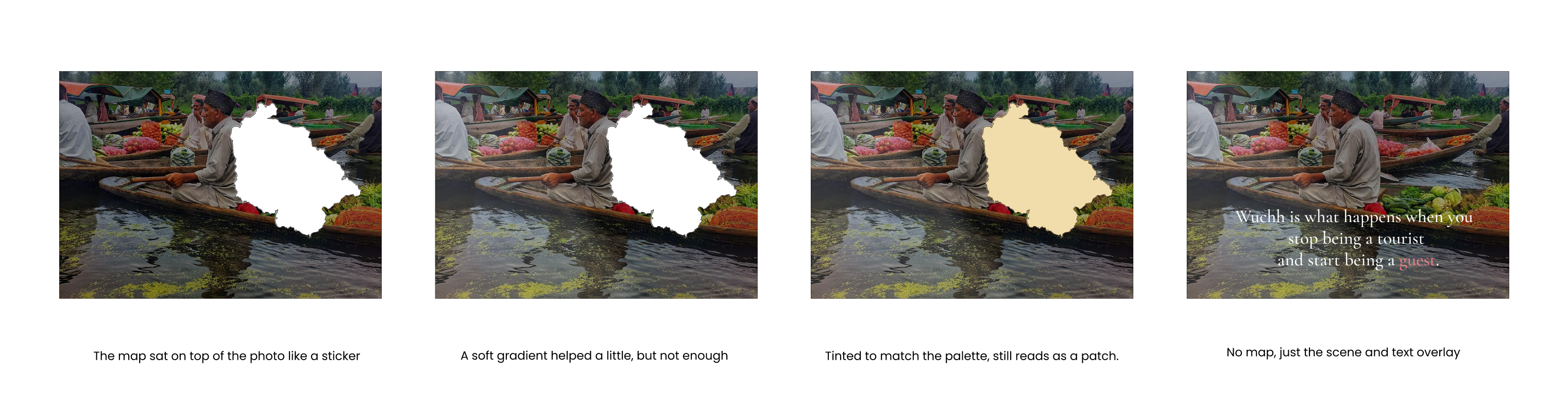
I was drawn to Local Narratives' interactive map, and tried it over a full photograph with shadows and overlays, but it always felt like a mark on the photo, not part of it. So I let it go: a big full screen image and oversized text. That felt right.

Experience cards: text over image
I wanted text sitting directly over the images. Drop shadows never made it instantly readable, so I tried a background frame behind the text, and that was it: immediately visible and far more accessible. I built the cards as reusable Figma components with a hover drop shadow for depth.
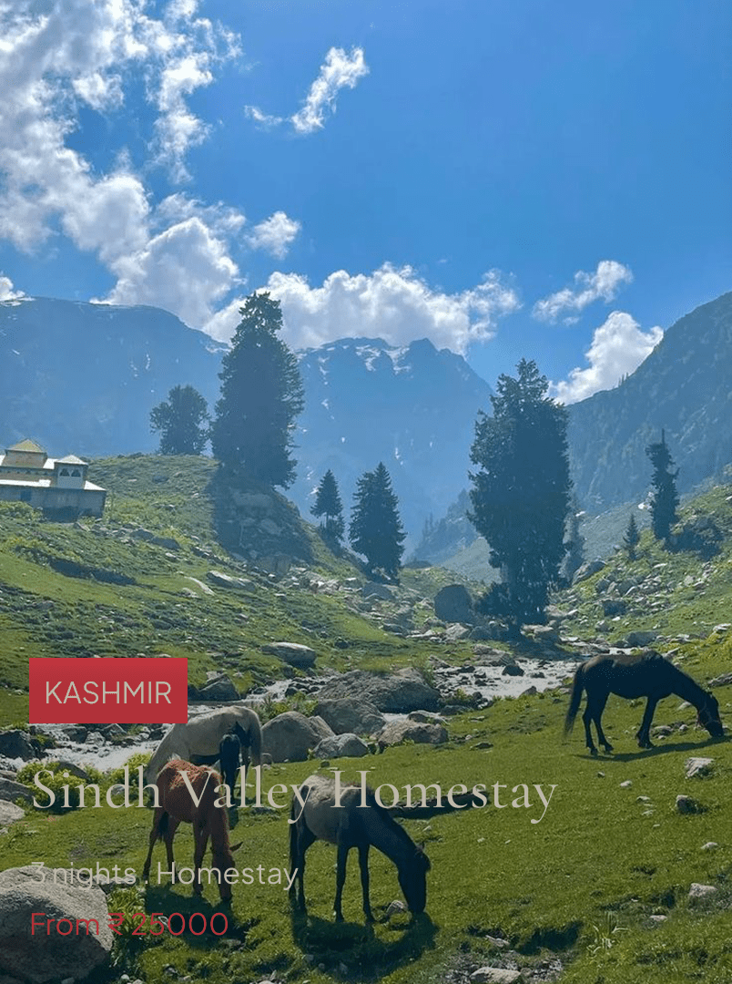
✗ Drop shadow only. Text never felt instantly readable over the photo.
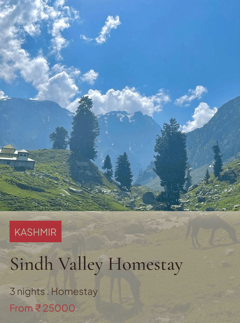
✓ Background frame. Clean separation and full legibility: the version I shipped.
Design 2 (selected)
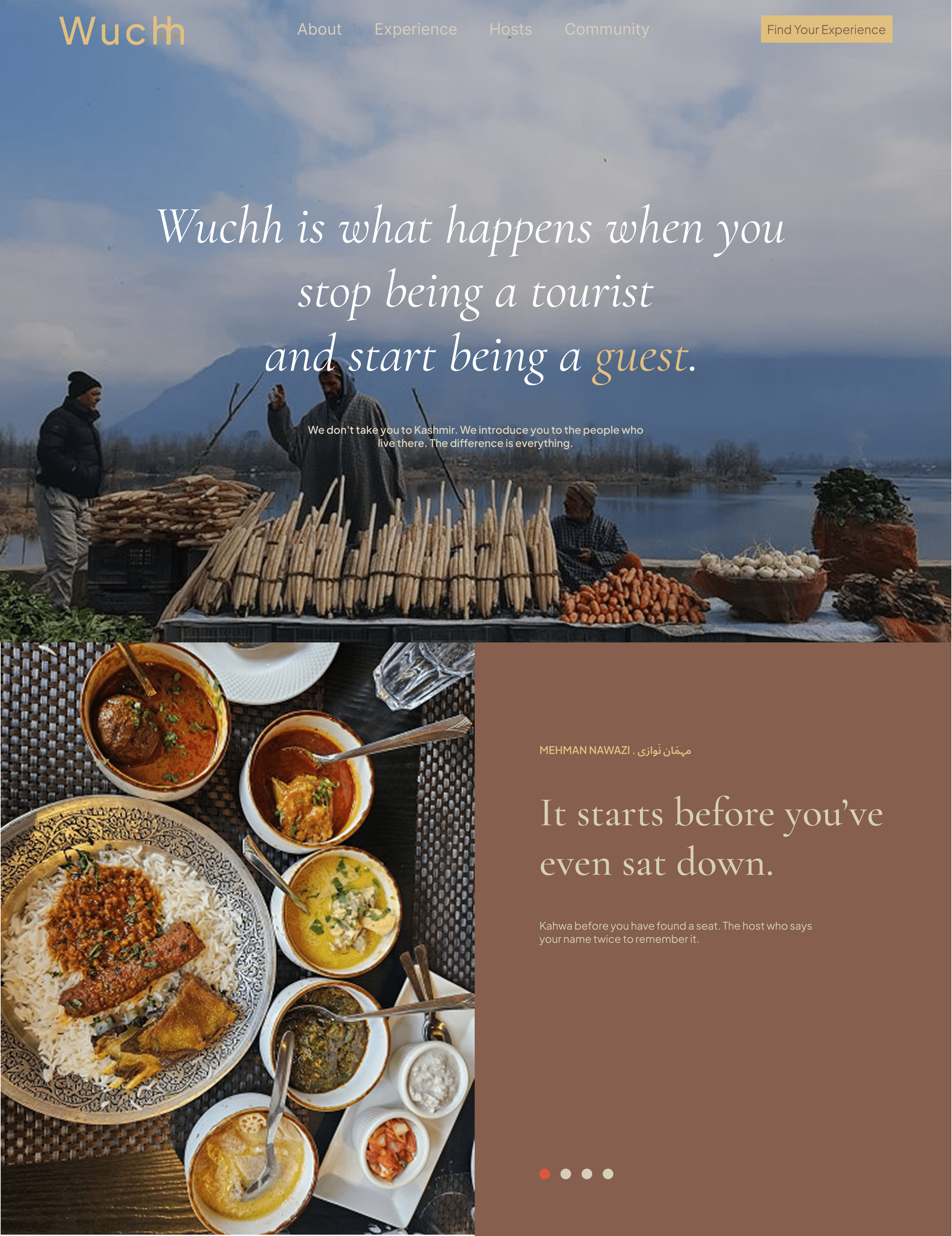
After Design 1, the hero and second section felt too connected: almost one long image with no moment to breathe. So I added a values section between them as a separator, with Kashmiri text for a local touch. For the experiences I dropped the static grid and made it horizontal: as you scroll down, the cards move sideways, pulling you through rather than pushing past.
Hero · before
Hero · after
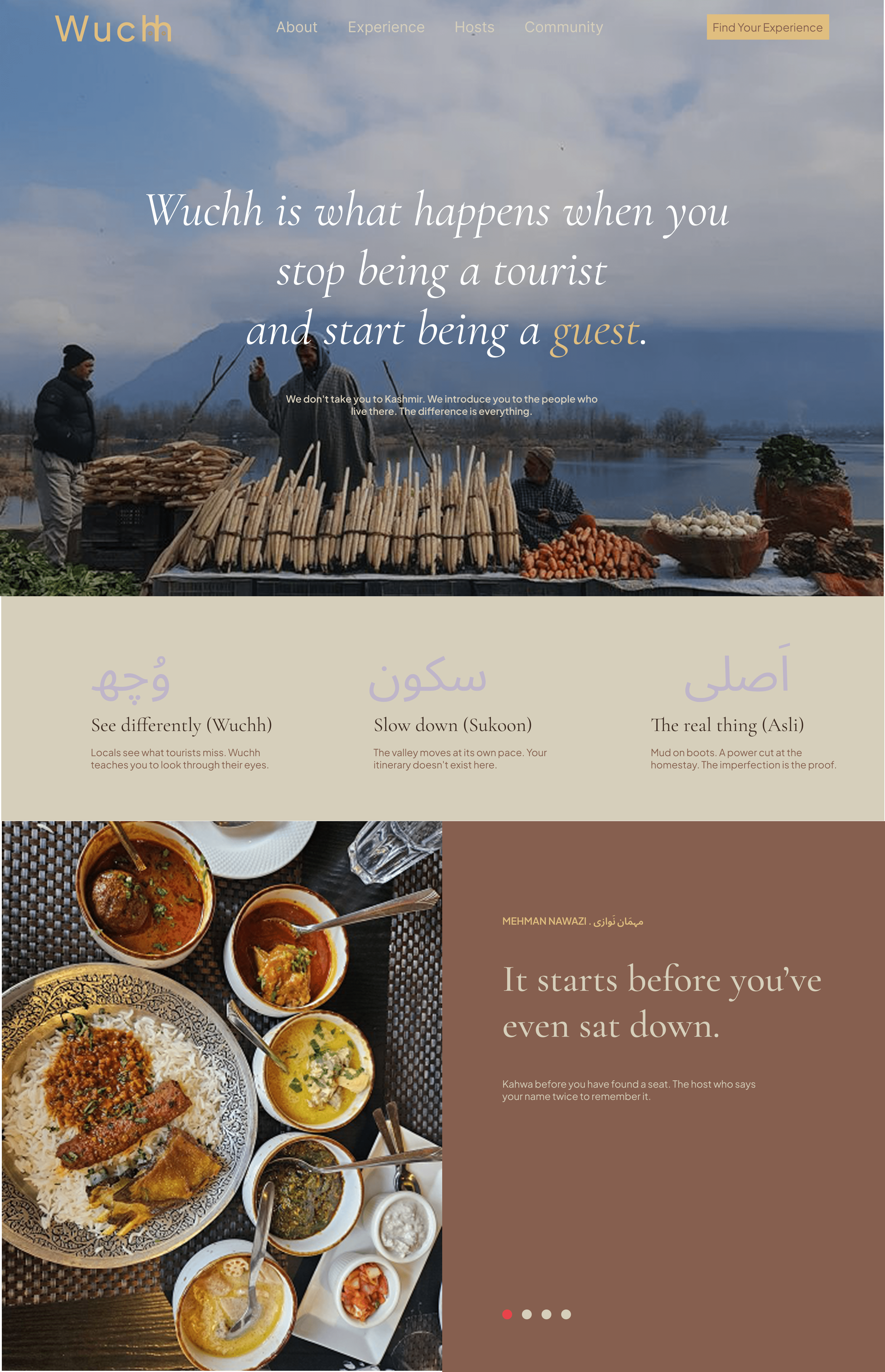
Experiences · before
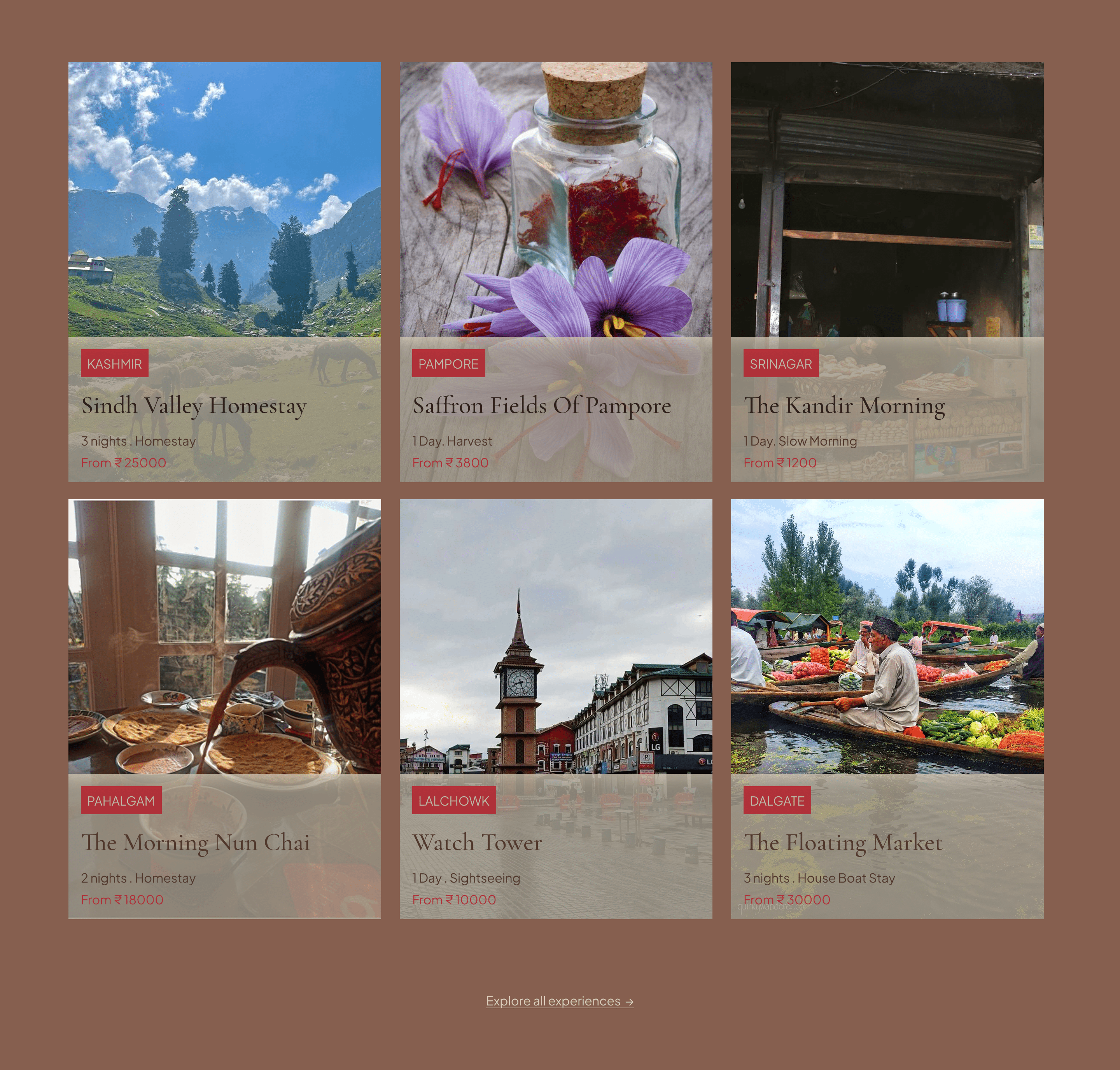
Experiences · after
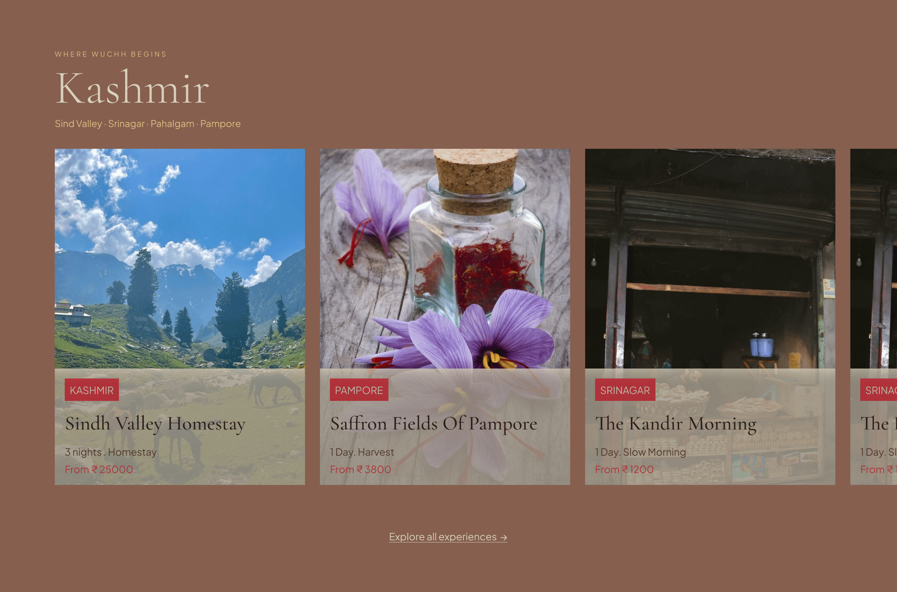
The final UI
Everything came together around one idea: the hero and first three sections tell a story through scroll. As you move down, Wuchh unfolds: "this is the feeling" → "this is who we are" → "this is how it works" → "this is where to go." Each scroll should feel like turning a page, not loading a section.
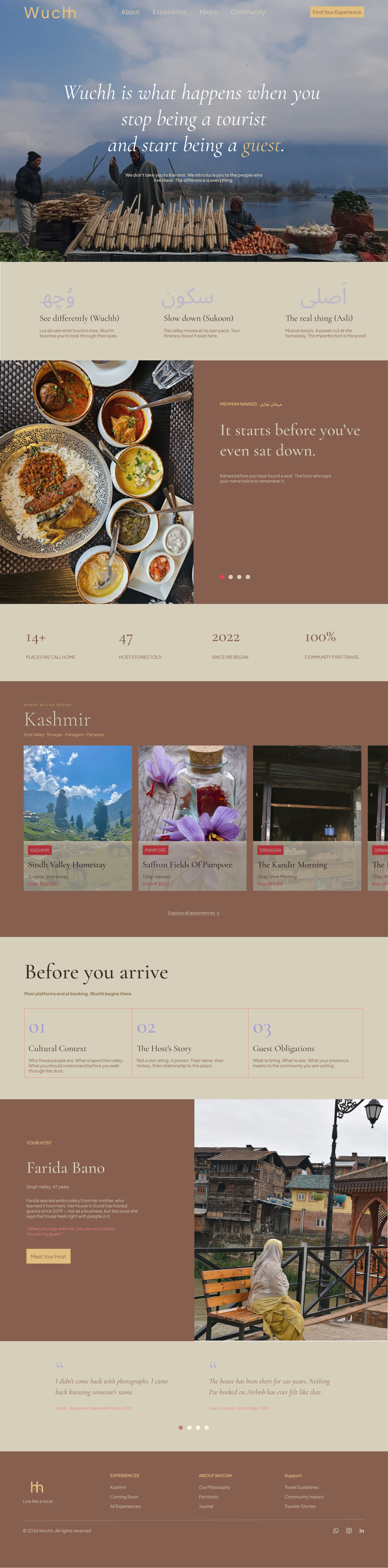
Design decisions, trends & tradeoffs
Most travel sites play it safe: white backgrounds, light colours, clean fonts. Kashmir isn't minimal; it's warm, layered, full of texture, so the design had to feel the same. The trends I followed earned their place: oversized typography that hits before you read; Kashmiri script mixed with English because why hide where you come from; warm earthy colours pulled from real life; candid photography because users can tell real from staged; and horizontal scroll because a static grid felt too passive for a brand about movement.
Bringing it to life
The assignment ended at the Figma file. But I wanted to know if Wuchh actually felt like something you could visit, not just look at, so after submitting I kept going and turned the design into a real, working site.
This was my first time taking a design from Figma to a live URL myself. I rebuilt the UI as a front end with Claude Design, pushed the code to GitHub, and deployed it on Vercel. Figuring out the handoff, the repo, and the deploy pipeline was as much a part of the learning as the design itself.
Reflections & learnings
- A name can carry a whole strategy. "Wuchh" gave the brand its meaning, its logo, and its point of view in a single word.
- Constraints sharpen decisions. Two days forced me to commit fast and justify every choice against one question: does this feel like Wuchh?
- Honesty beats gimmicks. Letting go of the interactive map kept the hero clean and true to the brand.
- Design local, not generic. Pulling colour and language from real Kashmiri life made the identity specific, and impossible to mistake for anyone else.